what is a depth chart

What Is a Depth Chart?
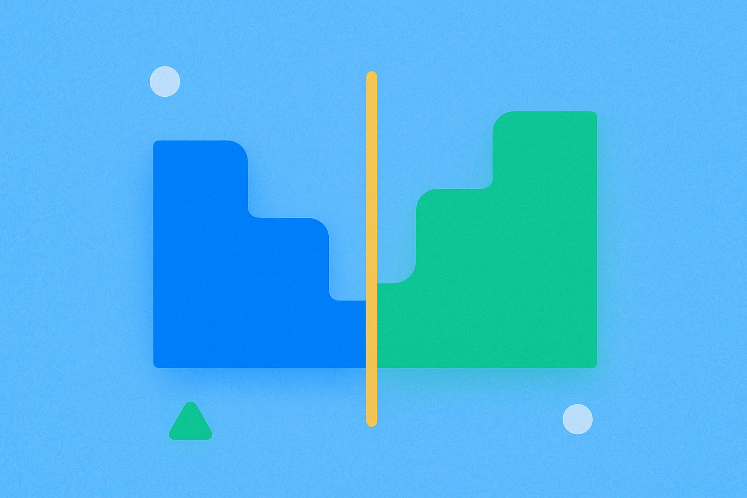
A depth chart is a visual representation of the market’s buy and sell orders.
It translates the order book data from an exchange into two curves or areas: buyers on the left and sellers on the right. The horizontal axis represents price, while the vertical axis shows cumulative order size—meaning the total quantity of buy or sell orders queued at or below/above a given price. The gap in the middle between the highest bid and lowest ask is known as the spread; the smaller this gap, the faster orders are matched and the lower the transaction cost.
You may notice sudden “spikes” at certain price levels on the chart—these are buy or sell walls, representing clusters of large pending orders. Buying just below a sell wall can be difficult to fill, while selling just above a buy wall may encounter strong demand support. Depth charts make these details visually accessible, helping you anticipate slippage—the cost incurred when your order executes at a worse price due to insufficient liquidity on the other side.
Why Should You Understand Depth Charts?
They have a direct impact on trading costs and risk management.
Major assets like BTC and ETH typically feature thick order books and tight spreads, meaning a $10,000 order barely moves the price. In contrast, smaller tokens or during off-peak hours, thin depth means even a few thousand dollars can push prices up or down significantly. By reading depth charts, you can anticipate these moves and avoid paying excessive slippage from impulsive trades.
During new token listings, major news events, or periods of high volatility, market depth can “thin out” and order walls move quickly. Monitoring the depth chart allows you to choose more prudent order types—such as limit orders, split orders, or even waiting on the sidelines—to reduce the risk of getting “stopped out” by price wicks.
For users engaging in grid trading, arbitrage, or task-based activities, understanding depth helps select better trading pairs and times, improving execution efficiency.
How Does a Depth Chart Work?
It transforms order book data into an intuitive curve.
An order book is essentially a list of buy and sell orders sorted by price. The system aggregates these orders at each price level, then calculates cumulative totals toward the center: buy side sums from the highest bid downward, sell side sums from the lowest ask upward. The vertical axis thus shows “total quantity available up to this price” waiting for execution.
There are typically two display modes: “non-cumulative” (bars/dots showing volume at individual price levels) and “cumulative” (stairs/area showing total volume from the current price inward). Most platforms default to cumulative mode because it better visualizes market impact.
Another common feature is price level aggregation—merging adjacent small price increments into broader bands (e.g., consolidating $0.01 increments into $0.10 bands). This smooths out the chart for quick assessment but for precise execution, switch back to finer intervals for detail.
What Does a Depth Chart Reveal in Crypto Markets?
The most direct indicators are spread, order walls, and changes in depth.
On centralized exchanges (CEXs) such as Gate’s spot or futures interface, you can toggle depth charts, adjust aggregation intervals, and view cumulative depth. When a new token launches, spreads are usually wide, depth is thin, and sell walls dominate; as market makers join and natural orders increase, spreads narrow and both sides of the chart thicken.
Before or after major market moves, depth can “breathe.” During intense volatility, many orders are canceled or swept away, causing both sides to steepen and spreads to widen. After news is digested and volatility subsides, the chart gradually returns to a smoother state.
On CLOB-based decentralized exchanges (order book DEXs) or perpetual contract platforms, the depth chart also helps assess slippage and liquidation risk. Unlike AMM-style DEXs that use pools for pricing, order book depth emphasizes queue distribution—making wall position and size especially important.
How to Use Depth Charts for Order Strategies
The goal is to leverage the chart’s volume and price distribution for more secure execution.
-
Choose Appropriate Aggregation and Display Modes
Overly broad aggregation hides details; too fine creates noise. Start with coarse intervals to spot major buy/sell walls, then switch to finer intervals for precise levels. -
Read Spreads and Assess Liquidity Timing
A tiny spread with smooth curves indicates ample liquidity—ideal for limit or small market orders. Wide spreads with steep curves require caution to avoid slippage. -
Locate Order Walls and Gaps
Below a wall offers support; above faces resistance. Gaps (thin zones) mean even moderate orders can move prices sharply. Avoid placing orders in weak areas or use walls for short-term execution for higher success rates. -
Estimate Market Impact and Split Orders
Analyze cumulative depth: If you plan to buy $10,000 worth but only $7,000 in asks exist within +0.3% of current price and $15,000 within +0.6%, a market order will likely incur 0.4%–0.6% slippage. Splitting your order under major walls often reduces cost. -
Select Order Tools and Set Risk Controls
On platforms like Gate, limit orders are suitable for passive fills near counterparties; splitting or time-weighted orders can average out market impact. Always set stop-loss/take-profit levels to manage sudden volatility risks.
Notable Trends and Data Points for Depth Charts
Liquidity has become increasingly uneven over the past year—making key metrics more crucial.
From 2025 through early 2026, major assets typically maintain narrow spreads most of the time, while long-tail assets show more pronounced daily spread and depth swings. For regular traders, monitor these four metrics:
- Spread: Stable periods usually see basis point-level spreads; volatile days may see several times wider. Smaller spreads mean faster matches and lower costs.
- Cumulative Depth: Check total order volume within ±X% of current price. For typical order sizes of $10k–$50k, focus on whether ±0.3% or ±1% cumulative volume meets your needs.
- 2% Depth-to-Volume Ratio: Measures “inventory” versus “flow.” In recent months, this ratio is high for popular pairs and low for long-tail pairs; it often drops sharply during market events.
- Top Five Level Concentration: Indicates whether too much volume is clustered at just a few price levels—high concentration increases vulnerability to rapid sweeps.
On the product side, between late 2025 and early 2026, many platforms have added cumulative/non-cumulative toggles, quick aggregation shortcuts, and market impact indicators to their depth charts. Mobile experiences are also improving for faster cost assessment during volatility.
How Does a Depth Chart Differ from a Candlestick Chart?
Depth charts show current liquidity; candlestick charts show historical prices.
A candlestick (K-line) chart displays open-high-low-close data and volume over time—useful for trend analysis. A depth chart visualizes current order distribution at each price level—helpful for assessing whether you can execute at your desired price/size and for estimating post-trade slippage and risk.
Using both together is optimal: if a candlestick chart shows price nearing resistance while the depth chart reveals a large sell wall, breaking through will require substantial volume; conversely, if sell walls are being absorbed and upper depth thins out, breakout probability increases. Set direction with candlesticks; fine-tune execution using the depth chart.
Key Terms
- Depth Chart: Visualizes buy/sell order quantities at various price levels for a trading pair, reflecting market liquidity distribution.
- Order Book: The source data for depth charts—a record of all open buy and sell orders on an exchange.
- Liquidity: The ability to buy/sell an asset quickly without causing major price changes.
- Spread: The difference between lowest ask and highest bid—the direct cost of trading.
- Trading Pair: A quoted unit of exchange between two assets (e.g., BTC/USDT).
FAQ
What Do Colors Represent in a Depth Chart?
Green typically indicates buy orders (bids), while red shows sell orders (asks). The deeper the green shade, the stronger the buying pressure at that price; darker red signals greater selling pressure. Observing both sides’ thickness and height lets you quickly gauge overall market supply versus demand.
What Do Spikes or Gaps Mean on a Depth Chart?
Spikes indicate large clusters of orders at certain prices—often representing psychological levels or support/resistance zones. Gaps signal low liquidity at specific prices that can be quickly breached. These features help you identify key levels and potential slippage risks.
How Do Illiquid Tokens Appear on Depth Charts?
Tokens with poor liquidity usually have steep and sparse depth charts with large gaps between orders. This means large trades cause significant slippage and sharp price swings. Before trading such tokens, always check their depth chart on leading platforms like Gate to ensure liquidity matches your trade size.
What Does It Mean When Large Orders Suddenly Appear Then Disappear?
This tactic is known as “order spoofing” or “order bombing,” where participants create fake liquidity to manipulate prices. If you see unusually thick orders that vanish quickly at key levels, it suggests possible psychological manipulation. Stay vigilant—don’t be misled by artificial liquidity.
How Can You Judge If a Token Is Worth Trading Using a Depth Chart?
Evaluate three main factors: overall depth (is order distribution balanced?), spread size (is it reasonable?), and cancellation frequency (are orders stable?). Uniform depth with tight spreads and stable orders suggests good liquidity and low trading costs; if not, risks are higher. Leading exchanges like Gate usually offer high-quality market depth.
Further Reading
Related Articles

Exploring 8 Major DEX Aggregators: Engines Driving Efficiency and Liquidity in the Crypto Market

What Is Copy Trading And How To Use It?
